Next project
Bajkin Studio Sonda
Project description
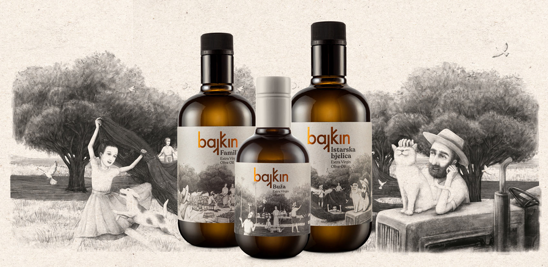
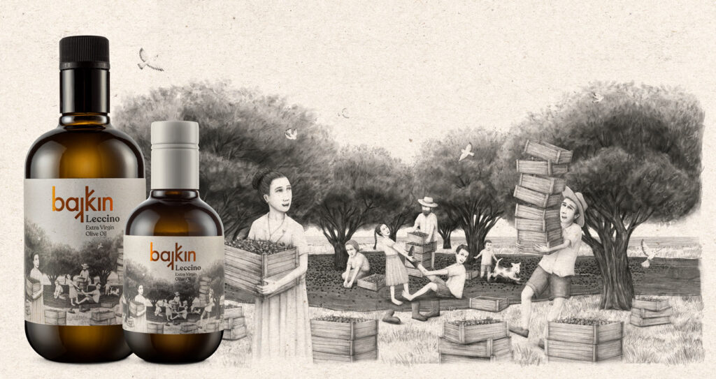
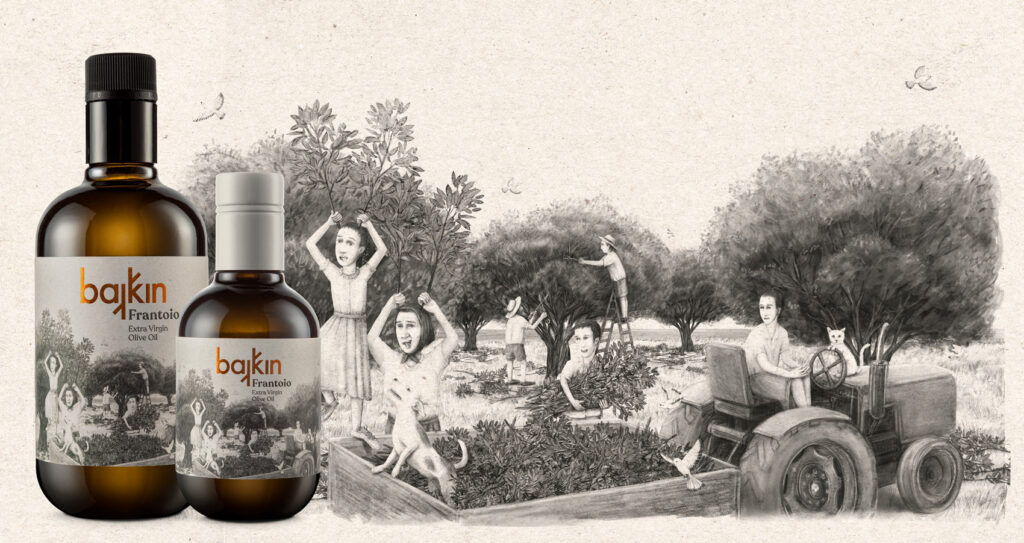
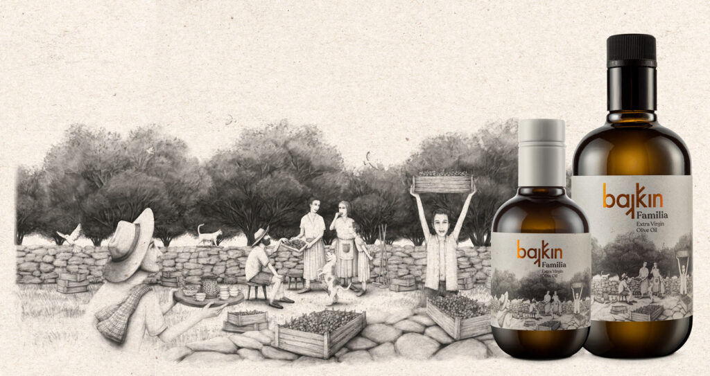
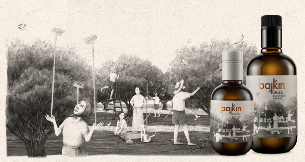
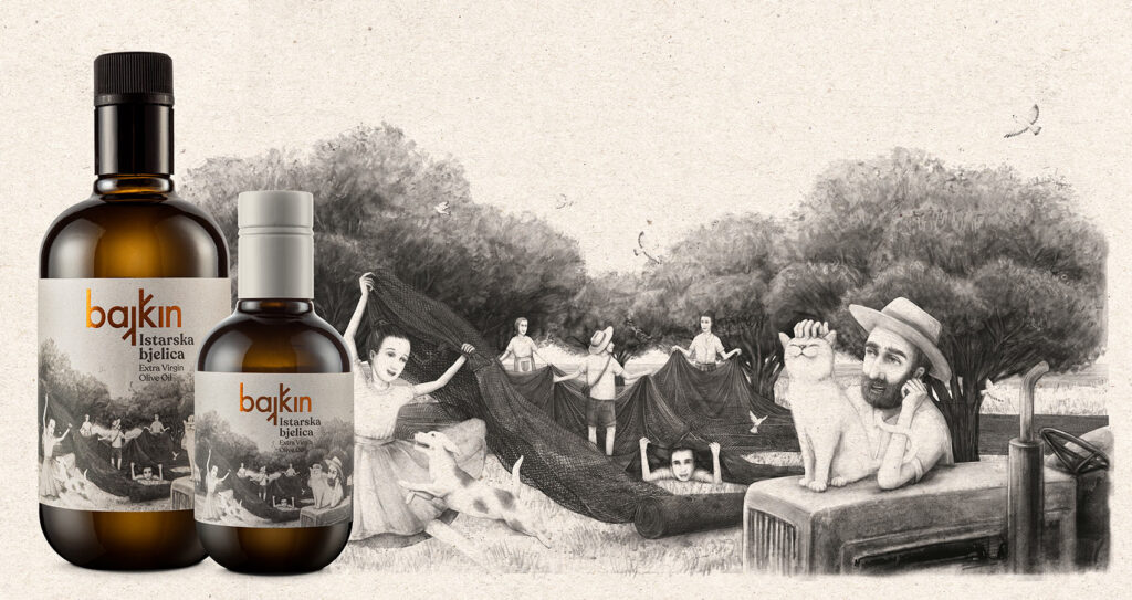
The label is designed to convey the strong connection of the producers to the place Bajkini and to communicate the family tradition of olive growing passed down from generations. The logo represents the fusion of roots as a symbol of generational permanence, the branched olive tree as a symbol of the activity and growth, and the name itself expressed through stylized typography. It tells a story of growing into the future while relying on the roots of the past. The illustrations depict warm family memories related to olive growing: from harvest scenes to breaks with homemade cakes. The ilustrations connect the past and present, emphasizing the brand’s authenticity and heritage.
The work is not in competition for the award
Project description
creative direction, copywriting and design
Jelena Fiškuš, Sean Poropat
design
Sanda Maričić, Valentina Beg, Rajko Ban
account executive
Sara Bažon
contributor
Ivan Stanišić ( illustration)
Client
OPG Loris Bajkin, Bajkini
Completed
11/2023
Previous project